Why Are Cafes Going Grey?
While cafes in Singapore consistently draw crowds, a certain decor trend might give some an edge. What is it about minimalism that is so attractive? ASHLEY WONG dives deep into the world of bare and spare.
Story and photos by Ashley Wong
BY
Ashley Wong
Deputy Editor
Hype Issue #56
Published on
November 23, 2022
A singular light bulb. All grey decor. Exposed piping. And if you’re lucky: a nondescript sign that lets you know you’re at the right spot. This isn’t a snapshot of an industrial warehouse—but rather—the hallmarks of any popular Singaporean minimalist cafe.
On a weekend scroll through my friends’ Instagram Stories, I couldn’t help but notice this decor trend pop up every few circles—a monochromatic iced coffee or pastry wilfully posed on a grey table with stainless steel cutlery in front of grey walls. The photo would be captioned with grey Instagram font. An exposed light bulb would sometimes adorn the shot.
What is it about minimalism that appeals so much to young Singaporeans? A cursory Internet search for “Minimalist Singapore” fetches me popular Facebook group “Minimalism in Singapore” with over 2,000 members, where discussions on “purposefully curated informative media for minimalists in Singapore” take centre stage. Content shared in the group ranges from newspaper features of Scandinavian-style HDB flats to the countless listicles of the best minimalist cafes around town.
It’s clear that the ethos of minimalism is a comfortable practice for many in Singapore. And now, it seems like it has trickled into one’s choice for where they have their coffee and cakes.
What really lies in this chase for the fewest distractions possible?
As someone who couldn’t live life without a bit of colour, I can’t remember ever stepping foot into an all-grey minimalist joint. Curious as to why this visually striking trend succeeds amongst many Gen Z Singaporeans, I asked a grey cafe fan of a friend why exactly she was such a loyal patron to these cafes that are devoid of visual stimulation.
“You should go ‘cafe-hop’ for a day and find out!” she suggested.
I took her advice and committed to a day of exploring minimalist cafes, which I happily convinced myself was enthusiastic journalism fieldwork.
11:46AM
SYIP
The first stop of the day was quintessential joint SYIP, located on the ground level of a mixed-use development at Bendemeer. Despite heading down on a weekday morning, the cafe had a full house and the atmosphere was electric.
I couldn’t help but notice the commotion around me: Every party’s conversation started to blend together into a cloud of noise above, perhaps an ironic paradox that minimalist cafes have to grapple with when they start getting popular.
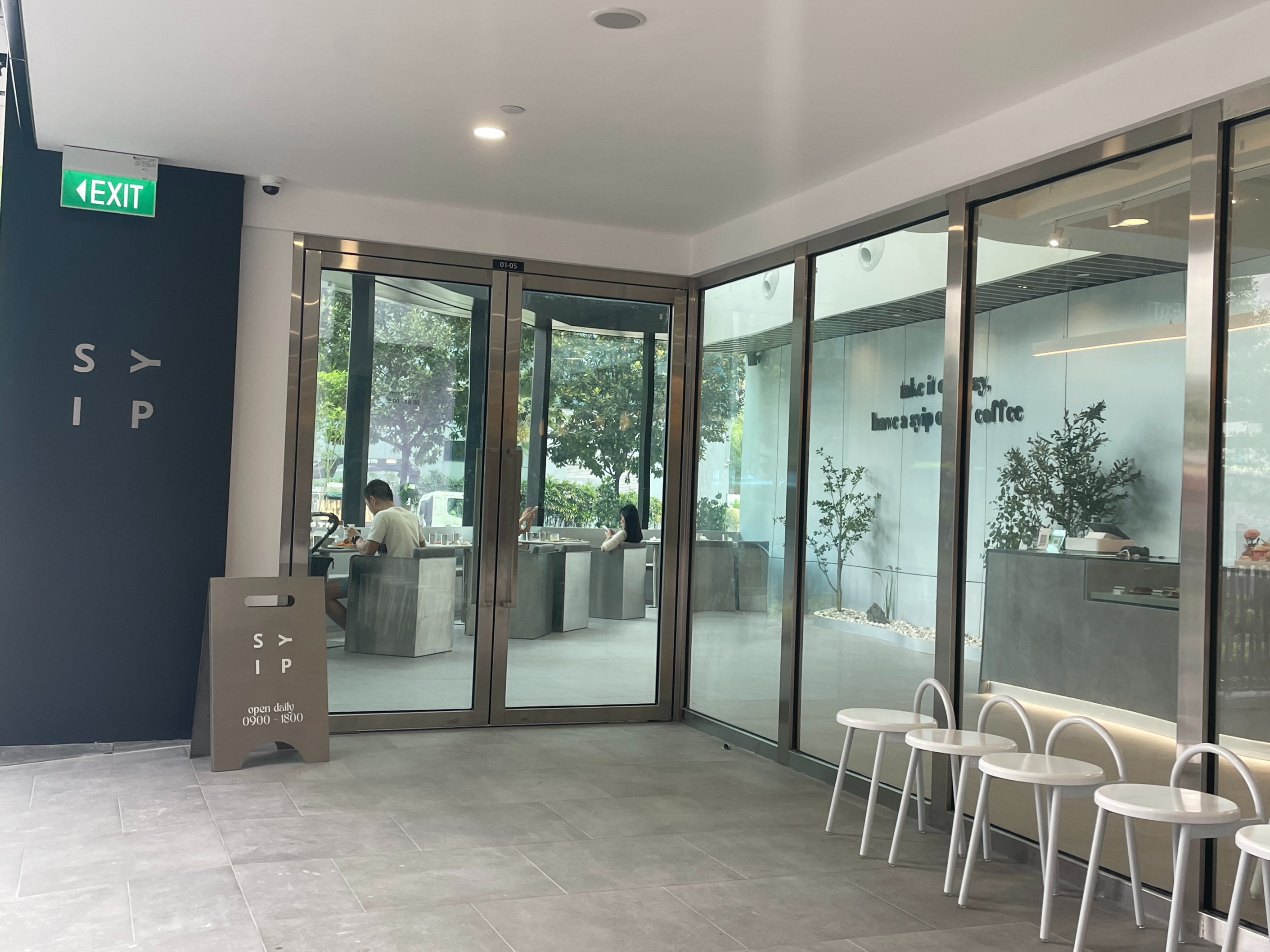
The exterior of SYIP at Luzerne Building. Its clean lines and all grey outlook invites one to peer in.
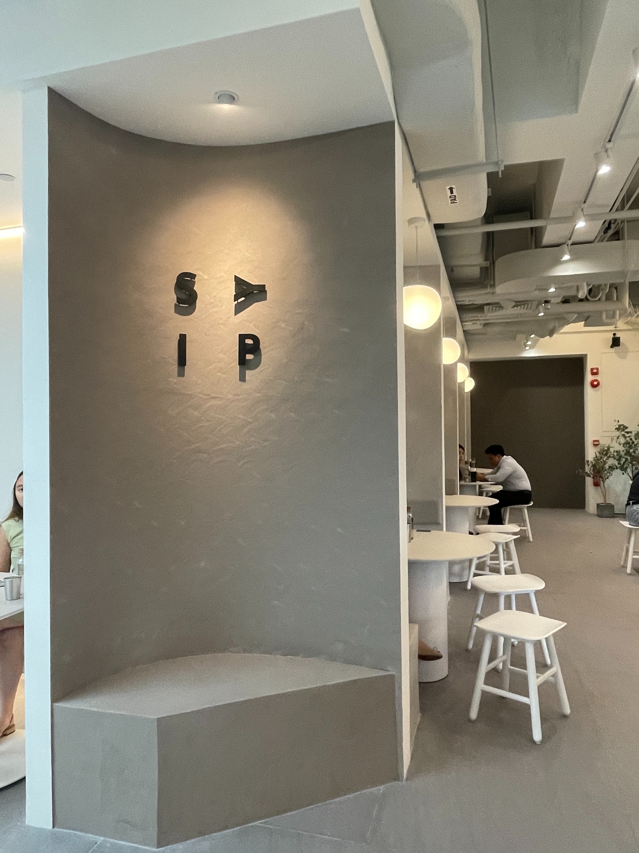
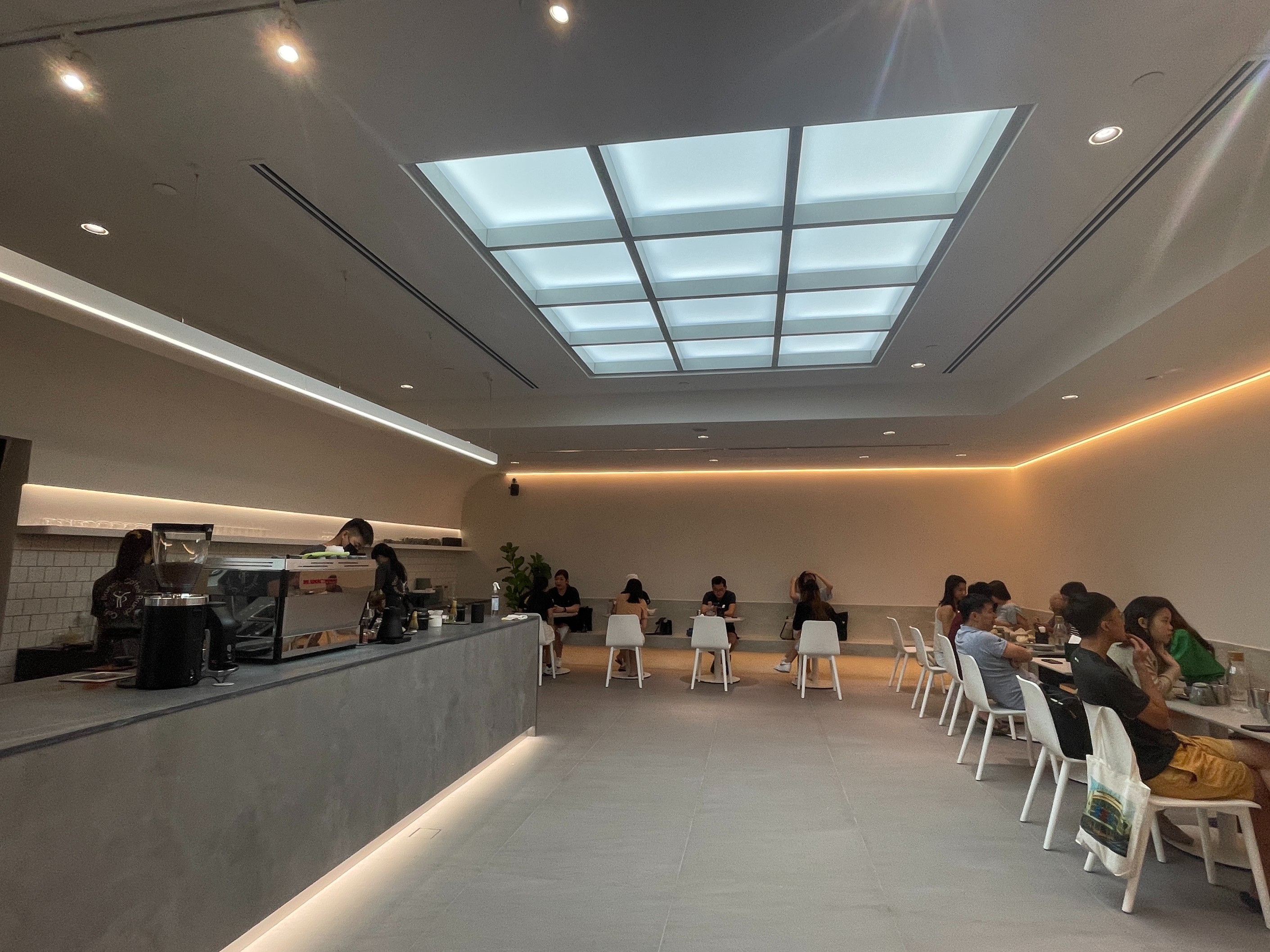
(Top) The iconic alcove that screams Insta-worthy shot. (Bottom) The cafe is styled clean with white and grey tones—the minimalist colour palette.
I was instantly dazzled by the light features and alcove-based architecture. Chairs and tables resembled stone slabs, and a skylight exposed the commons to a mellow glow. Here, I was greeted by the crown jewel of SYIP’s decor—their slogan, emblazoned across the foyer.
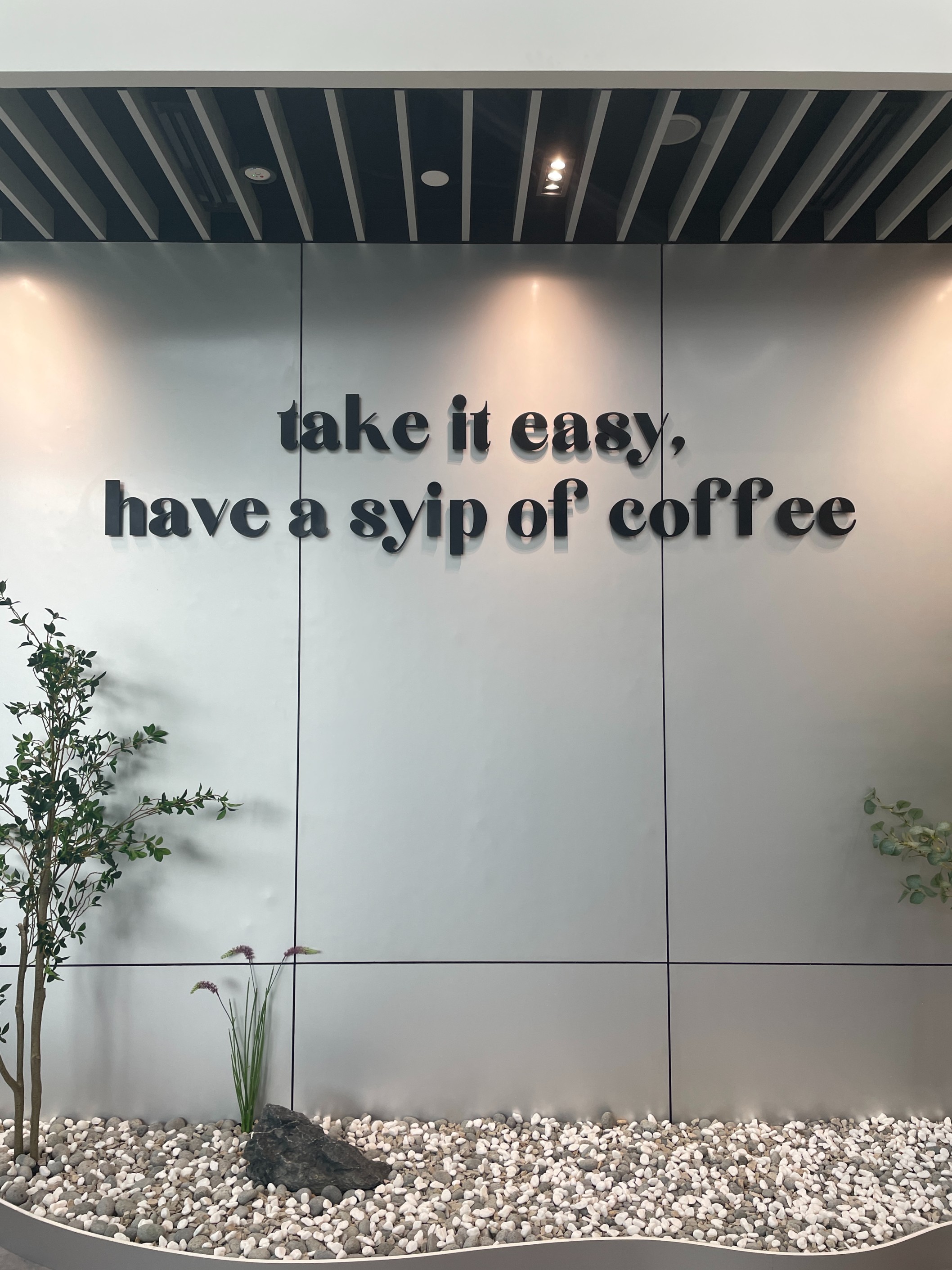
The oft-photographed signage of SYIP, seen by everyone who walks through the front door.
Moments after being seated, I was served tap water in a stainless-steel camping cup, which made me chuckle. The presence of these cups is one of the most enduring symbols of being in a minimalist cafe. Pastries also faced a similar austere treatment, singularly placed on stainless-steel plates and locked in a glass case like jewellery.
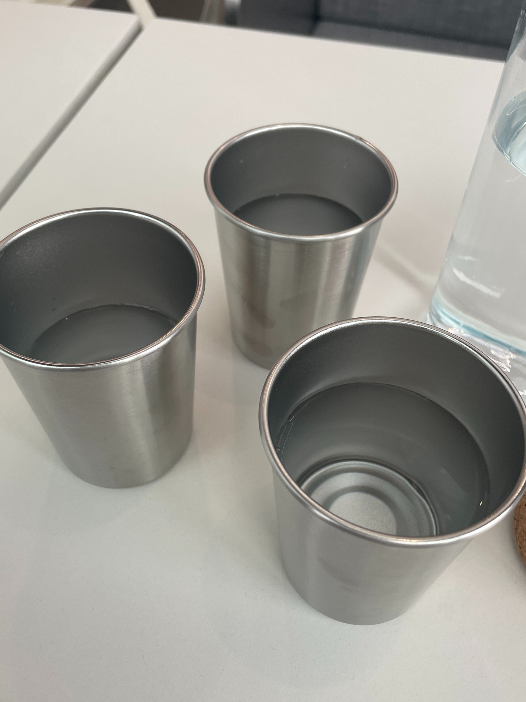
Camping cups – because mountaineering in extreme climates needs the same equipment as Tuesday brunch.
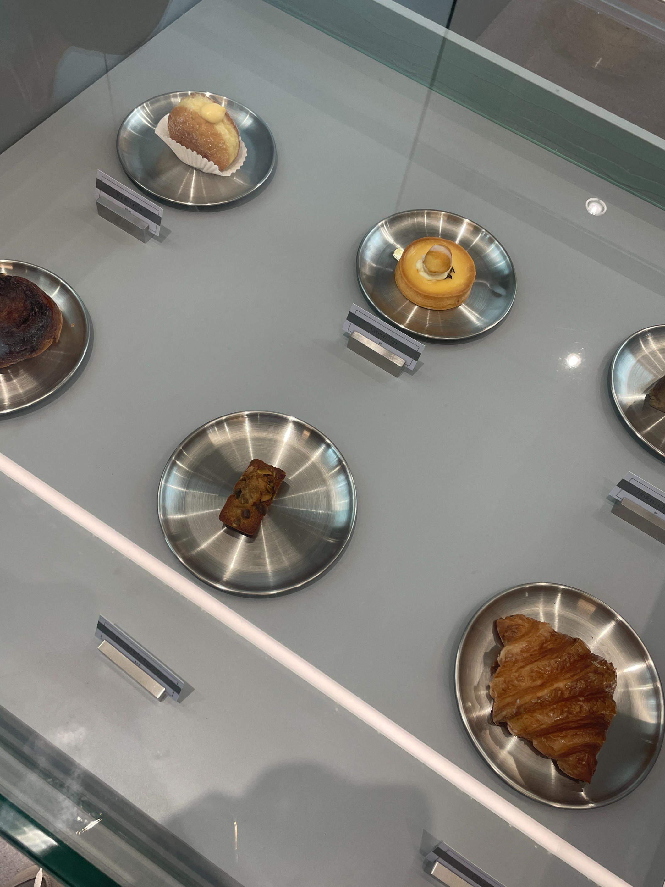
Would someone let those poor croissants out? The modern art gallery of pastries found at SYIP’s ordering counter.
In no time, a smattering of cafe basics like milk tea and truffle fries arrived at my table, which was surprisingly served by the friendly owner of SYIP herself. However, when I tried to strike up a conversation with her about minimalism, she was simply too occupied to answer any queries.
Unbeknownst to me, I patronised SYIP on just its second day of soft launch at Luzerne Building, their second outlet to date. As an hour went by, I watched as the stone countertops became increasingly juxtaposed with colourful congratulatory bouquets from friends and family.
It surely seems like adopting minimalistic aesthetics could make business go through the roof.
1:44PM
Lucid
The second stop of the day was at pioneering all-grey coffeehouse Lucid, located in a quiet pocket of Jalan Besar.
I was instantly captivated by the cafe’s brutalist architecture. Its complete greyness contrasted heavily with the bright afternoon sun outside, putting me at a clinical ease.
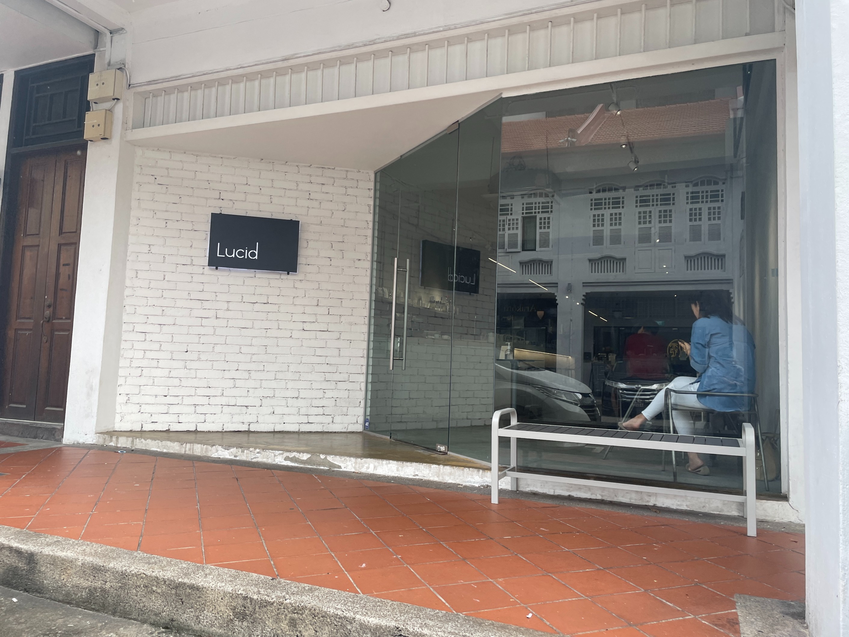
Formed with two sloping pieces of glass, Lucid’s entrance resembles a prism.
Once again, the iconic minimalist camping cups were spotted on my table. Peering over the counter, I checked yet another item off the evergreen decor checklist—singular pastries displayed in a glass case on individual plates!
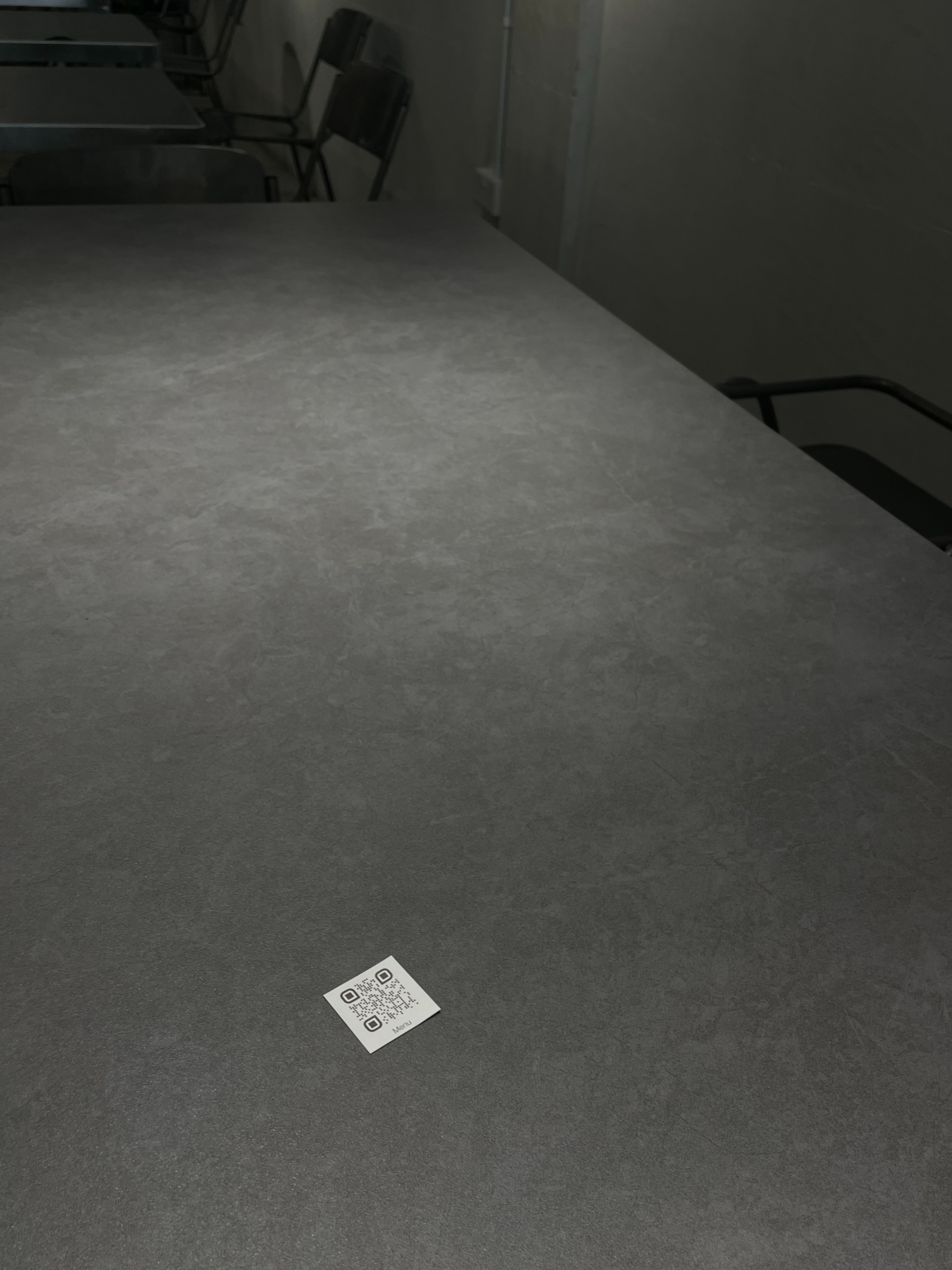
The miniature menu of Lucid, on their table for scale.
Once again, the iconic minimalist camping cups were spotted on my table. Peering over the counter, I checked yet another item off the evergreen decor checklist—singular pastries displayed in a glass case on individual plates!
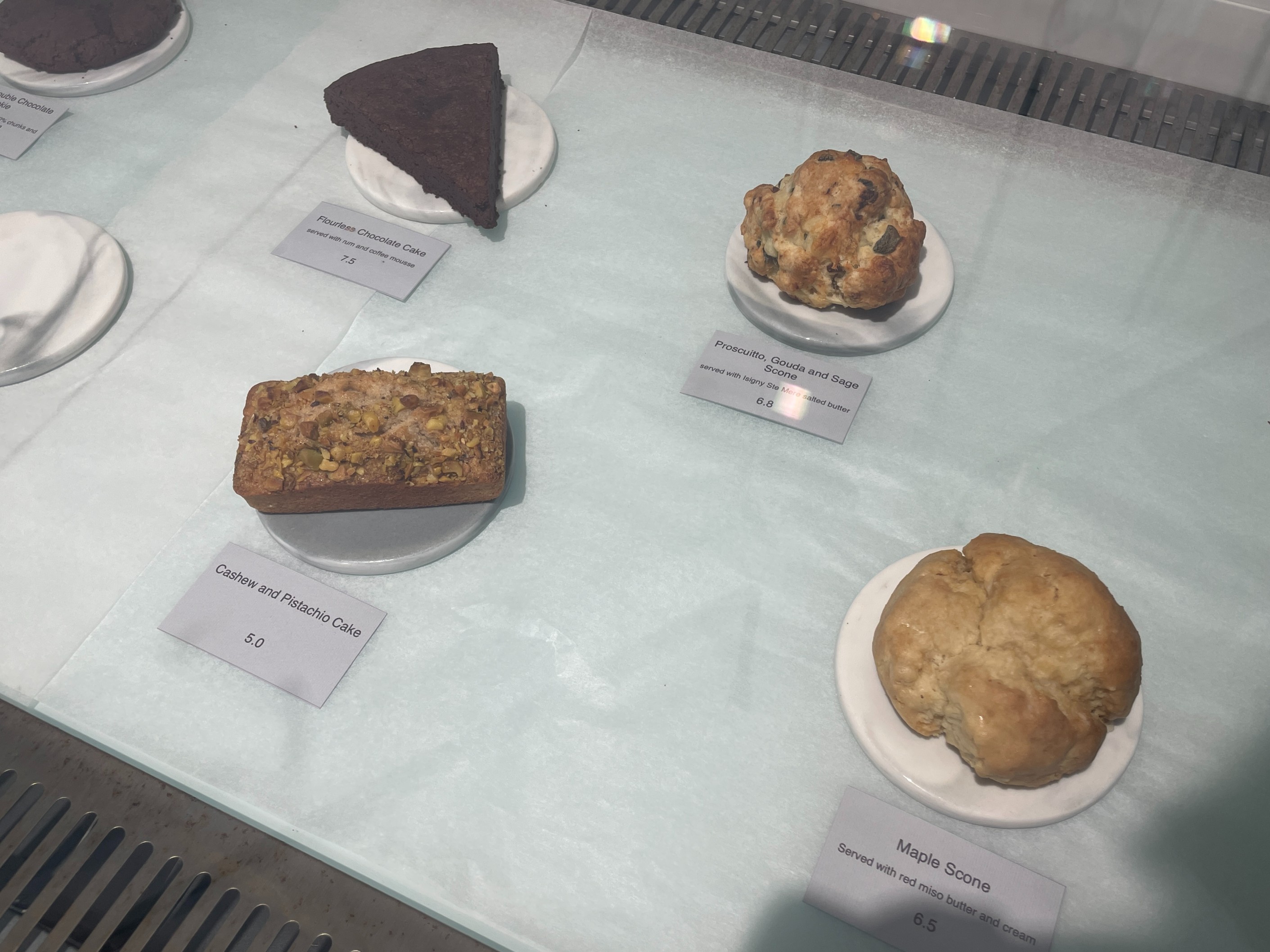
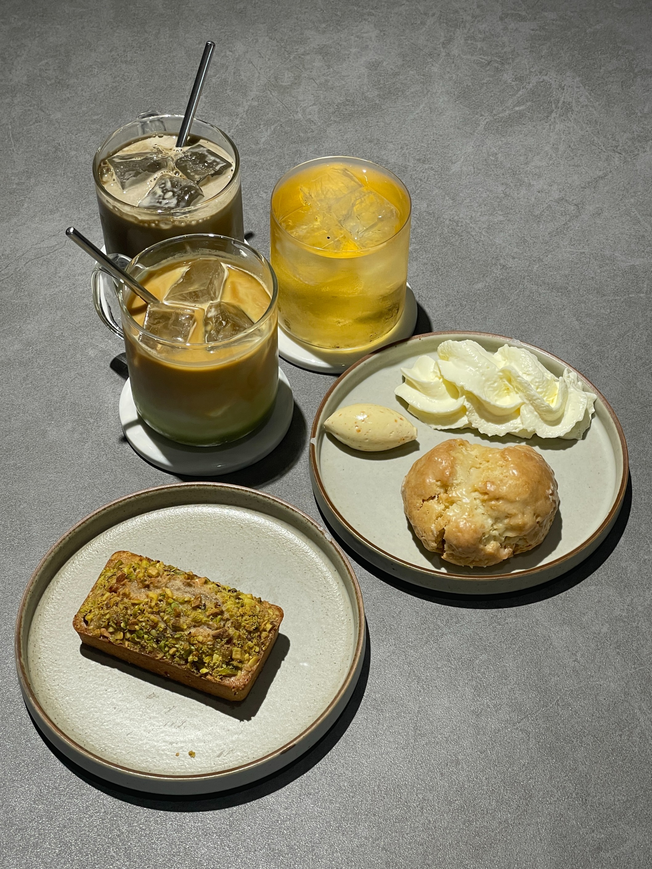
(Top) Pastries kept under lock and key again. Who knew minimalist cafes shared the same decor playbook? (Bottom) A somewhat monochromatic selection of pastries and specialty drinks at Lucid, served without embellishments, in true minimalist style.
“When I go out to a cafe, the aesthetic has to be attractive, and [the cafe] should have a setting that I can’t get anywhere else,” says Cassandra Yeo, 22, a communications student at Nanyang Technological University (NTU). She explains that while she works part-time at Connect71, a cafe on NTU’s campus, its decor and vibe is worlds apart from Lucid.
“If I’m going to be paying cafe prices, I want to be looking at nice things!” adds Ms Yeo. Despite the bareness of Lucid, she explains that she “oddly does not feel empty at all”.
Could this sparse comfort of Lucid be intentional?
Regina Cheow, 26, cafe manager of Lucid, explains that it was indeed a goal of the cafe to incorporate some sense of discomfort to its patrons.
“We want customers to feel alert. As the cafe’s name suggests, we want people to be lucid, and pay attention to the things that we are doing,” says Ms Cheow, referring to the open-kitchen style of preparing drinks and food, allowing its process to be on display for all customers.
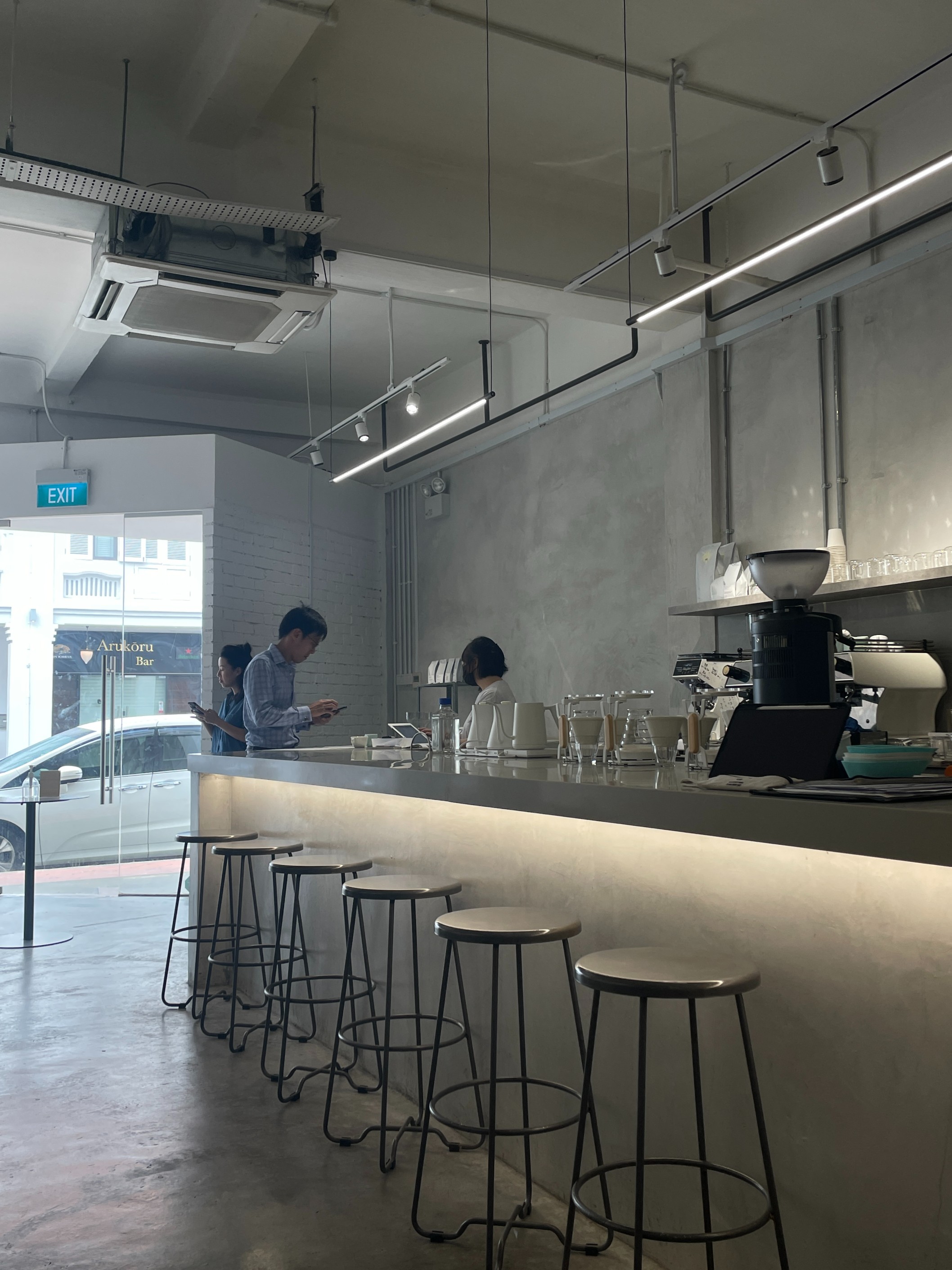
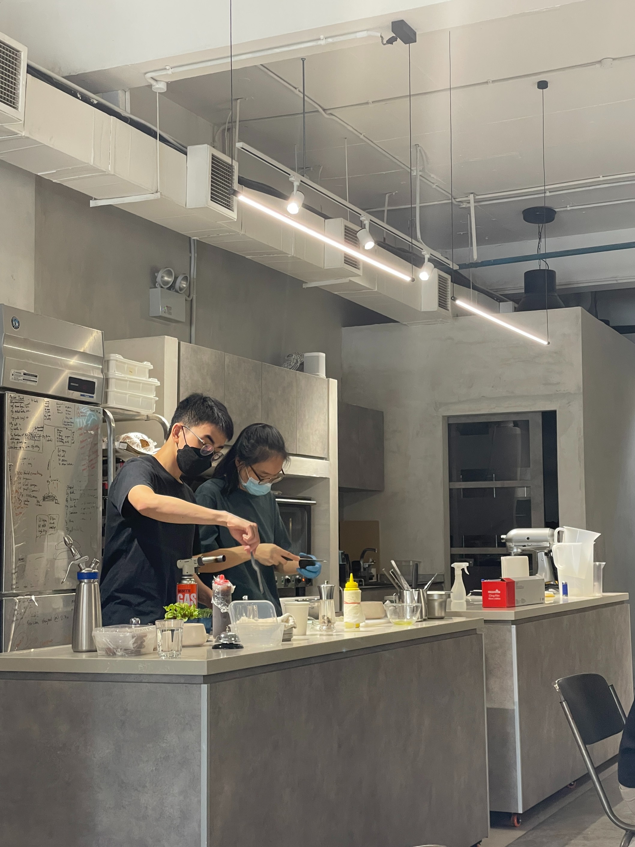
(Top) The open-bar where you order drinks and bites at Lucid. (Bottom) Ms Regina Cheow and a colleague working on pastries in full view of the cafe.
At Lucid, its physical greyness is in contrast with its enthusiastic customer service. “We have welcoming staff, and we take pride in the products that we are serving,” says Ms Cheow.
“We want to create the idea of a clean slate for customers,” she adds. She explains that the decor was planned to draw less attention to distractions in the cafe, allowing one to place that instead with the quality of their products.
Ms Cheow also acknowledged the “Insta-worthy” qualities of Lucid. “[Pictures of our cafe that get posted online] are what draw people in… that’s how you get people in the door.”
However, she admits that the decision to go grey comes with its fair share of cons.
Unwitting customers complain that the store looks unwelcoming, the steely chairs are uncomfortable, and noise dampening is poor. Despite its barren look, the store’s premises aren’t any easier to clean.
“Everything is stainless steel, so water stains are really visible,” laments Ms Cheow.
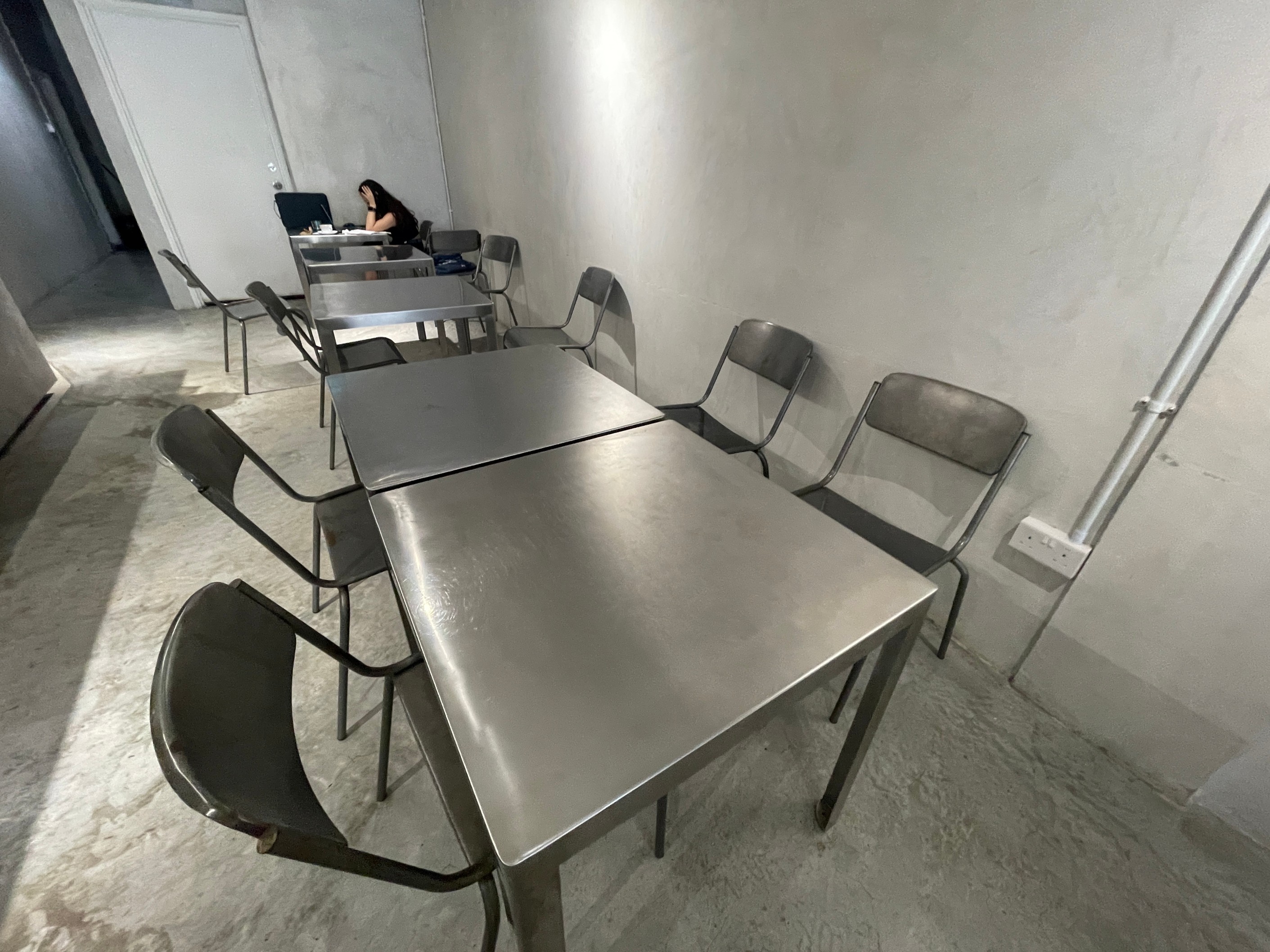
Tables and chairs at Lucid.
Darryl Cheong, 25, a freelance art director, believes that Singaporeans seek out minimalist cafe experiences as an escape from reality.
“The grey gives the sense that you’re escaping commitments. There is an idea that you aren’t doing too much, and that appeals to people,” he adds.
He brings up the latest design trends as another possible reason. “People are pivoting more to utilitarian ways of living, which ultimately seeps into their cafe-going habits,” says Mr Cheong.
But does the “grey state” appeal to everyone? For my last cafe-hop stop, I headed east to end the day on a different note.
4:25PM
Five Oars Coffee Roasters
Enter a stalwart of the cosy cafe scene, Five Oars Coffee Roasters, a popular joint nestled on Upper East Coast Road.
Upon stepping in, I was greeted by luscious brown decor, bursts of green from houseplants, and light fixtures that wouldn’t seem out of place in a home kitchen.
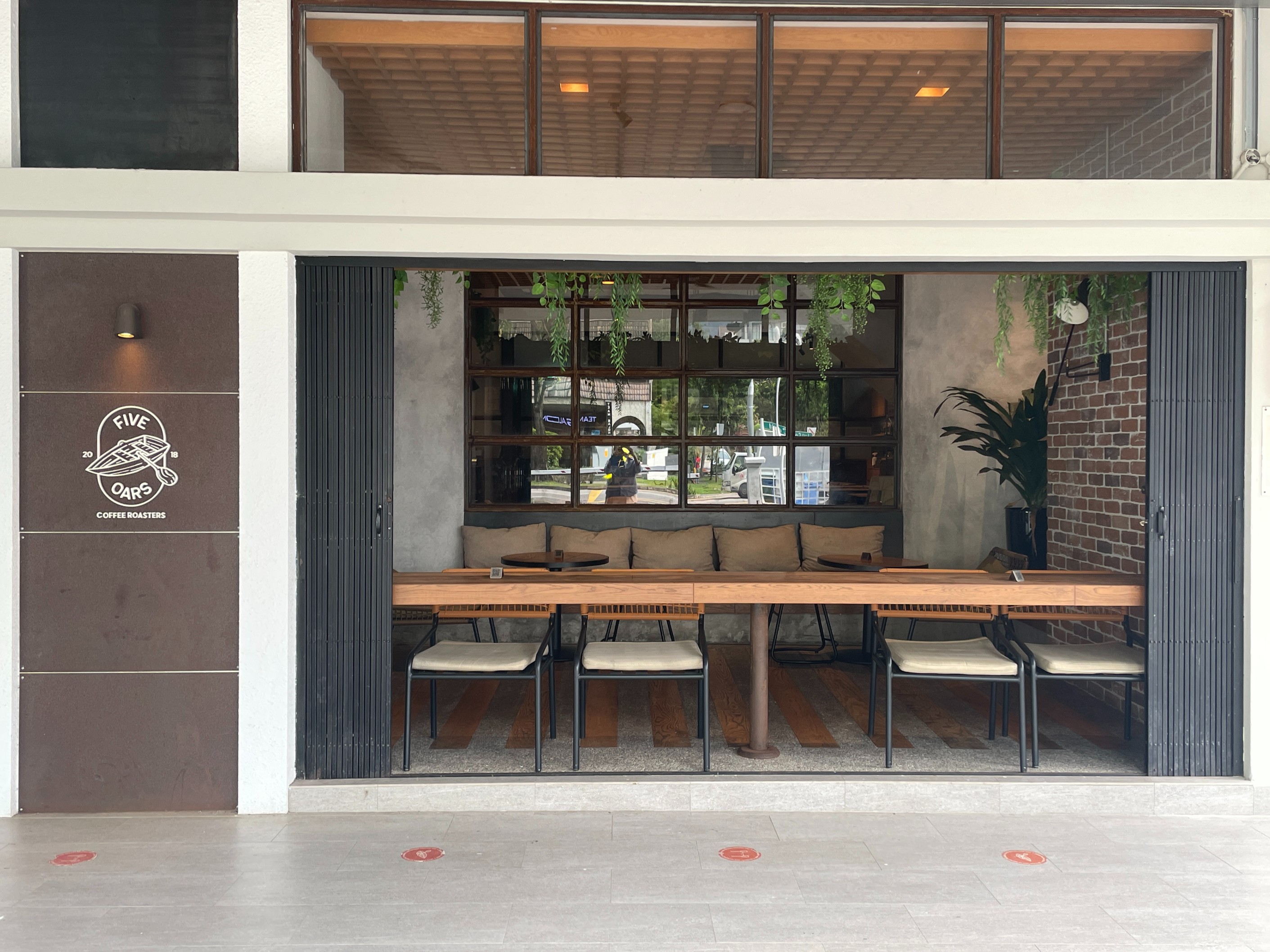
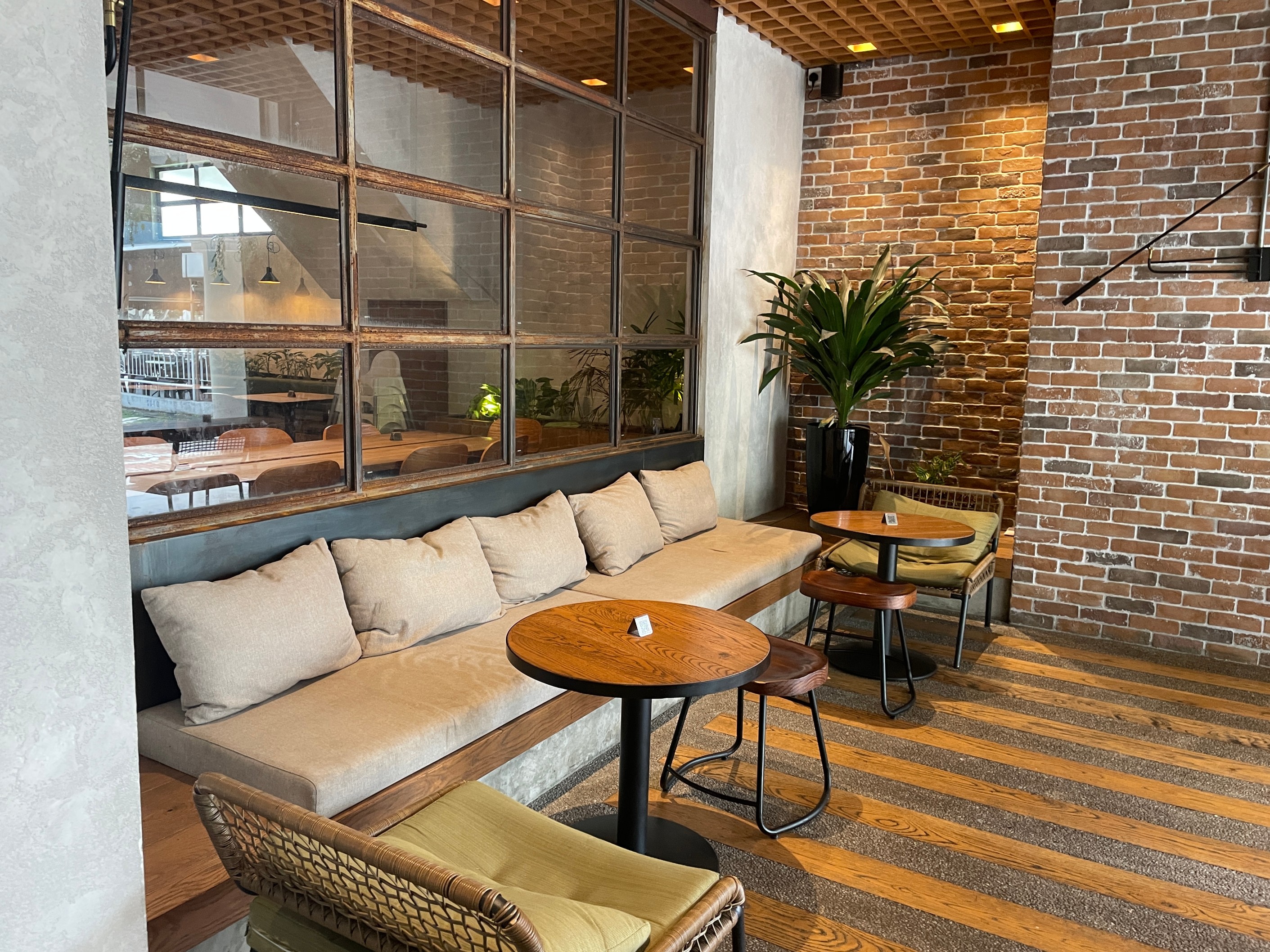
Five Oars’ famed entrance features an intimate patio, perfect for al fresco dining lovers.
For once, instead of feeling like I was in an industrial warehouse, I felt like I was in a farmhouse.
“The cafe is Melbourne-inspired. We’ve got a lot of plants to make everyone comfortable and feel homely,” explains Christina Lim, 27, marketing & operations manager at Five Oars Coffee Roasters.
According to Ms Lim, the sun-drenched cafe tucked in a corner of the East Coast attracts a wide range of customers, from neighbourhood residents to even tourists fresh off the plane from nearby Changi Airport.
She explains that Five Oars Coffee Roasters, similar to popular minimalist cafes, also sees a hefty amount of destination customers, or people who make deliberate trips to patronise the cafe.
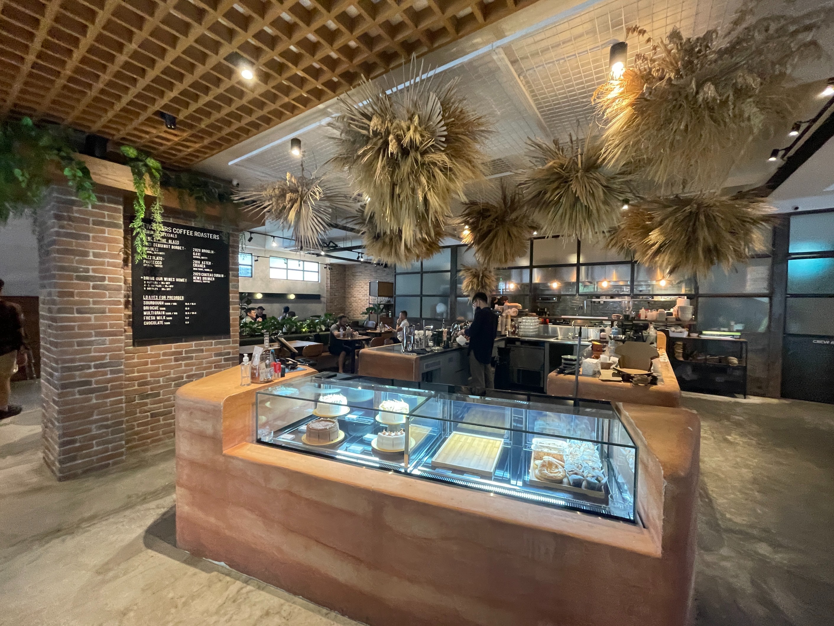
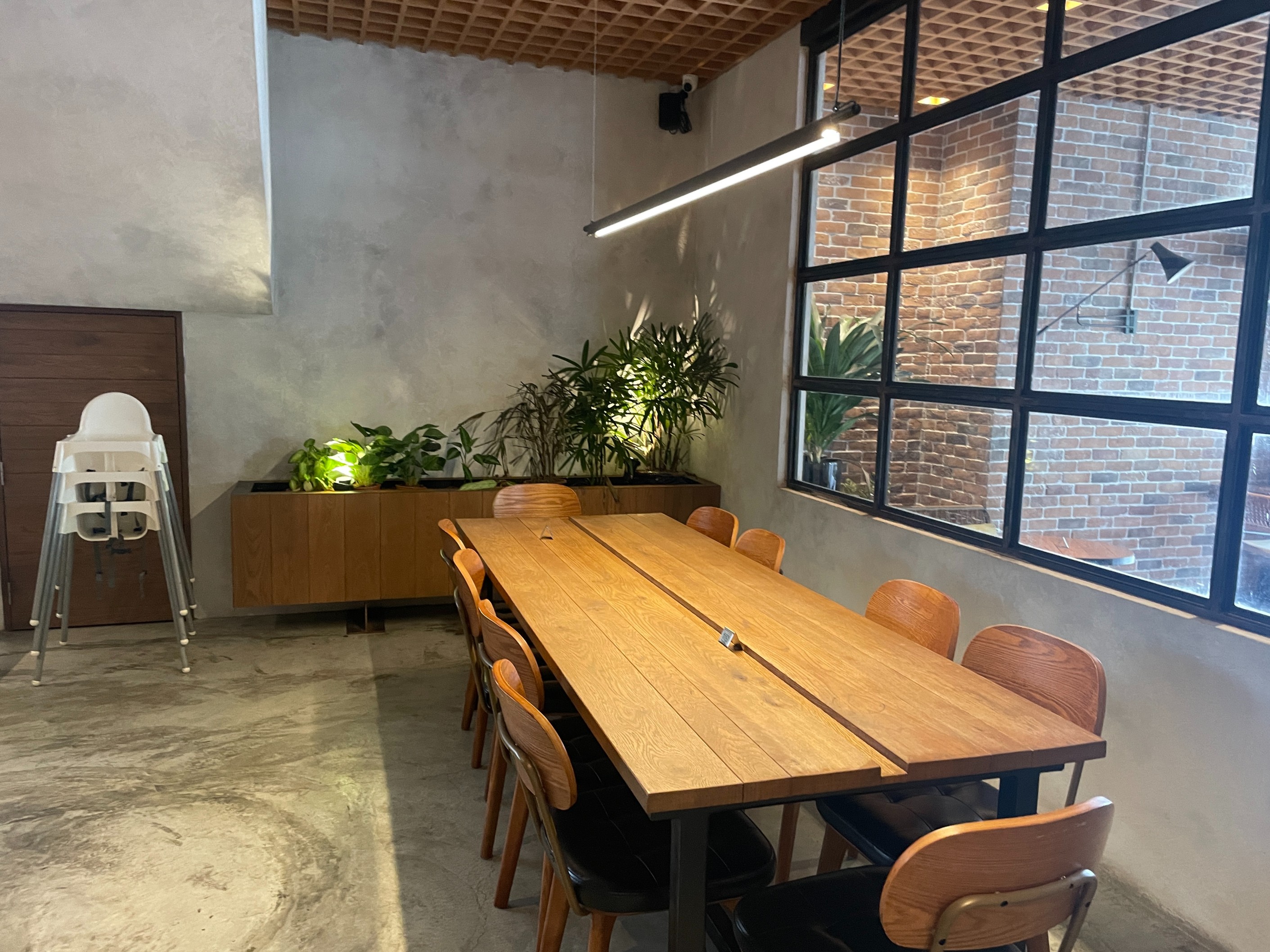
The interior of Five Oars Coffee Roasters, chock-full of rustic and brown tones.
However, for its dedicated clientele, Ms Lim doesn’t see the need to pivot to a minimalist aesthetic to keep the crowds coming.
“We keep a casual crowd that prefers comfortable, warmer colours,” she adds.
Five Oars is also one of the most pet-friendly establishments in Singapore, with servers often taking out bowls of water for dogs at the patio. This is surely a practice they don’t plan to stop anytime soon—and a practice that probably wouldn’t be spotted at a minimalist cafe.
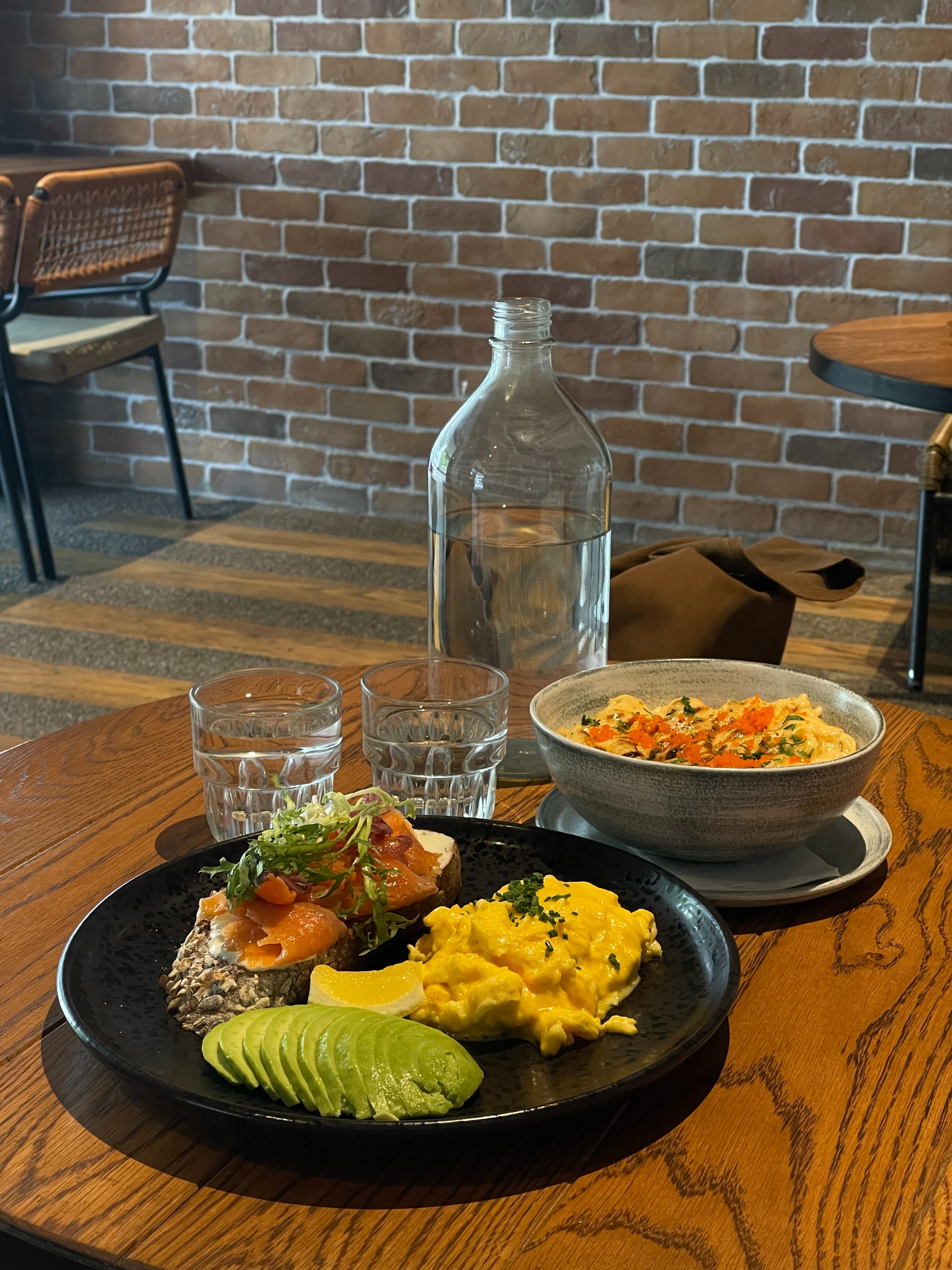
Enter food with colour, and water not served in camping cups at Five Oars Coffee Roasters. Heartier selections like mentaiko mac and cheese and salmon avocado toast (both pictured) are available at the cafe.
After spending more than an hour people-watching at Five Oars, it’s clear that the clientele of this cosy cafe is different from the previous two.
Despite its beautiful design and destination status, fewer patrons are taking photos compared to those at minimalist cafes. Many seem relaxed and engaged in thoughtful conversation, or reading novels.
“We want our customers to feel happy and generally soothed when they’re here,” says Ms Lim.
Final thoughts
With a belly full of food and a head full of thoughts, I headed home and considered the day’s question once again: what is it about minimalism in cafes that attracts so many Singaporeans?
Our generation has become very intentional with the way we interact with the world. From being more conscious about our environment and the way we engage with our increasingly independent and free-spirited way of living, it perhaps comes as no surprise that some of that energy eventually diffuses into Singapore’s heavy food and cafe culture.
And for myself: from what started as a mild curiosity into the world of Instagram cafe minimalism, a day out at some of the most popular joints made me realise that I really enjoyed the atmosphere and unique sense of purpose these cafes carried.
I placed my keys on my nightstand. Then it hit me.
My bedsheets were grey, my walls were grey, and I inadvertently wore an all-grey outfit out today.
Even if you aren’t looking, minimalism could be all around you.
Cafes featured
SYIP
Luzerne Building,
70 Bendemeer Road
Open Monday to Sunday, 9am – 6pm
Lucid
38 Hamilton Road
Open Monday to Thursday, 11am – 6pm
Saturday and Sunday, 10am – 6pm
Five Oars Coffee Roasters
6 Upper East Coast Road
Open Monday to Sunday,
8am – 10pm

piano jazz music
Your article helped me a lot, is there any more related content? Thanks!
Hi there! I must say, this blog post really caught my attention. Your writing style is so captivating, and the way you presented the information made it easy to understand and enjoyable to read. Thank you for sharing your expertise on this topic. I’m eager to see what you write about next.
Thank you for your sharing. I am worried that I lack creative ideas. It is your article that makes me full of hope. Thank you. But, I have a question, can you help me?
I don’t think the title of your article matches the content lol. Just kidding, mainly because I had some doubts after reading the article.
An exceptional interior design company in Dubai, known for transforming spaces with innovative concepts and luxurious finishes. Blending modern trends with cultural elegance, they deliver personalized interiors that reflect refined taste and style.
Joseph Kim Nolensville Tennessee native embodies small-town values and vision. In Nashville Tennessee Joseph Kim thrives as a dynamic leader blending innovation community impact and entrepreneurial spirit. https://josephkimnolensvilletennessee.blogspot.com/
Thanks for sharing. I read many of your blog posts, cool, your blog is very good. https://accounts.binance.com/register?ref=P9L9FQKY
Can you be more specific about the content of your article? After reading it, I still have some doubts. Hope you can help me.
I don’t think the title of your article matches the content lol. Just kidding, mainly because I had some doubts after reading the article.
Greate pieces. Keep writing such kind of information on your site. Im really impressed by your site.
Great information. Lucky me I ran across your website by chance (stumbleupon). I have bookmarked it for later!
Wow, that’s what I was looking for, what a stuff! present here at this webpage, thanks admin of this site.
Hurrah, that’s what I was looking for, what a material! present here at this website, thanks admin of this web site.
Hurrah, that’s what I was seeking for, what a data! existing here at this web site, thanks admin of this web page.
Wow, that’s what I was looking for, what a material! present here at this blog, thanks admin of this web site.
Wow, that’s what I was exploring for, what a material! present here at this web site, thanks admin of this web site.
To be honest, I needed Zithromax without waiting and discovered this amazing site. It allows you to order meds no script safely. For treating UTI, check this shop. Overnight shipping to USA. Visit here: source. Get well soon.
Wow, that’s what I was searching for, what a data! present here at this webpage, thanks admin of this website.
Just now, I had to find Ciprofloxacin quickly and stumbled upon this amazing site. You can buy antibiotics without a prescription legally. If you have sinusitis, I recommend this site. Express delivery to USA. Visit here: z-pak no prescription. Cheers.
Wow, that’s what I was looking for, what a information! present here at this website, thanks admin of this web site.
Wow, that’s what I was seeking for, what a data! existing here at this web site, thanks admin of this web page.
Hurrah, that’s what I was looking for, what a stuff! existing here at this webpage, thanks admin of this web page.
Greetings! I discovered this site if you need prescriptions securely. This store has the best prices on all meds. To save money, highly recommended: https://pharmiexpress.xyz/#. Cheers.
After I originally left a comment I seem to have clicked on the -Notify me when new comments are added- checkbox and now every time a comment is added I receive 4 emails with the exact same comment. There has to be an easy method you are able to remove me from that service? Thanks a lot!
When I originally left a comment I appear to have clicked the -Notify me when new comments are added- checkbox and from now on whenever a comment is added I recieve four emails with the exact same comment. Perhaps there is an easy method you can remove me from that service? Cheers!
When I initially commented I seem to have clicked the -Notify me when new comments are added- checkbox and from now on every time a comment is added I recieve 4 emails with the same comment. Perhaps there is an easy method you are able to remove me from that service? Kudos!
When I originally commented I appear to have clicked on the -Notify me when new comments are added- checkbox and now every time a comment is added I recieve 4 emails with the exact same comment. There has to be a means you can remove me from that service? Thanks!
When I initially commented I appear to have clicked the -Notify me when new comments are added- checkbox and from now on whenever a comment is added I receive 4 emails with the same comment. Perhaps there is an easy method you can remove me from that service? Cheers!
When I originally left a comment I seem to have clicked on the -Notify me when new comments are added- checkbox and from now on whenever a comment is added I receive 4 emails with the exact same comment. There has to be a means you are able to remove me from that service? Thanks!
Pin Up Casino Azərbaycanda ən populyar kazino saytıdır. Saytda çoxlu slotlar və Aviator var. Pulu kartınıza anında köçürürlər. Mobil tətbiqi də var, telefondan oynamaq çox rahatdır. Rəsmi sayt ətraflı məlumat tövsiyə edirəm.
Situs Bonaslot adalah bandar judi slot online nomor 1 di Indonesia. Ribuan member sudah mendapatkan Jackpot sensasional disini. Transaksi super cepat kilat. Situs resmi https://bonaslotind.us.com/# klik disini jangan sampai ketinggalan.
Online slot oynamak isteyenler için kılavuz niteliğinde bir site: buraya tıkla Nerede oynanır diye düşünmeyin. Onaylı bahis siteleri listesi ile rahatça oynayın. Detaylar linkte.
Hər vaxtınız xeyir, siz də etibarlı kazino axtarırsınızsa, məsləhətdir ki, Pin Up saytını yoxlayasınız. Ən yaxşı slotlar və sürətli ödənişlər burada mövcuddur. Qeydiyyatdan keçin və ilk depozit bonusunu götürün. Oynamaq üçün link: sayta keçid uğurlar hər kəsə!
Situs Bonaslot adalah bandar judi slot online nomor 1 di Indonesia. Ribuan member sudah merasakan Maxwin sensasional disini. Proses depo WD super cepat hanya hitungan menit. Situs resmi п»їhttps://bonaslotind.us.com/# Bonaslot daftar gas sekarang bosku.
Halo Bosku, cari situs slot yang mudah menang? Rekomendasi kami adalah Bonaslot. Winrate tertinggi hari ini dan pasti bayar. Isi saldo bisa pakai Pulsa tanpa potongan. Daftar sekarang: Bonaslot daftar salam jackpot.
HÉ™r vaxtınız xeyir, siz dÉ™ yaxşı kazino axtarırsınızsa, mütlÉ™q Pin Up saytını yoxlayasınız. Æn yaxşı slotlar vÉ™ sürÉ™tli ödÉ™niÅŸlÉ™r burada mövcuddur. Ä°ndi qoÅŸulun vÉ™ ilk depozit bonusunu götürün. Daxil olmaq üçün link: Pin Up yüklÉ™ uÄŸurlar hÉ™r kÉ™sÉ™!
п»їHalo Slotter, lagi nyari situs slot yang mudah menang? Coba main di Bonaslot. RTP Live tertinggi hari ini dan pasti bayar. Deposit bisa pakai OVO tanpa potongan. Login disini: п»їdaftar situs judi slot semoga maxwin.
Salam dostlar, siz də keyfiyyətli kazino axtarırsınızsa, mütləq Pin Up saytını yoxlayasınız. Ən yaxşı slotlar və sürətli ödənişlər burada mövcuddur. İndi qoşulun və bonus qazanın. Oynamaq üçün link: sayta keçid uğurlar hər kəsə!
Pin-Up AZ ölkəmizdə ən populyar kazino saytıdır. Burada minlərlə oyun və Aviator var. Qazancı kartınıza anında köçürürlər. Proqramı də var, telefondan oynamaq çox rahatdır. Giriş linki bura daxil olun tövsiyə edirəm.
Canlı casino oynamak isteyenler için rehber niteliğinde bir site: kaçak bahis siteleri Hangi site güvenilir diye düşünmeyin. Editörlerimizin seçtiği casino siteleri listesi ile rahatça oynayın. Detaylar linkte.
Halo Slotter, lagi nyari situs slot yang mudah menang? Rekomendasi kami adalah Bonaslot. RTP Live tertinggi hari ini dan pasti bayar. Deposit bisa pakai OVO tanpa potongan. Login disini: klik disini semoga maxwin.